
Spruce Up Your Site with Animations: Now on NEKO Mobile & Tablet!
With animations on NEKO mobile and tablet, you can create captivating experiences on all versions of your responsive website!
Getting Started With Your New Mobile Animations
With the new mobile and tablet animations that you've had on desktop, you can now use them to help draw attention as they browse your site, so they better know what to look at and where to go.
To add animations: go to the mobile or tablet site version you wish to edit, click the context menu of the element you want to animate, and click Entrance Animation. There are several different animations to choose from.
Note: Animations are separated between desktop, mobile and tablet. For example, if you change the mobile animation, it doesn't change any others!
Mobile Animations - Best Practices
Animations are a great way of drawing attention to specific areas on your website and encouraging visitor's to engage in actions you want them to. Need to encourage visitor's to your site to scroll down? You can use an animated downward arrow to solve that problem.
Animations on mobile should be thoroughly thought out, it's best to keep the following practices in mind:
Mobile & desktop are different.
Mobile sites are usually more playful, so on mobile the animations you choose may reflect this! For example, what looks right on desktop (like a slide in from the right) might display even better as a bounce on mobile.
Mobile sites are usually more playful, so on mobile the animations you choose may reflect this! For example, what looks right on desktop (like a slide in from the right) might display even better as a bounce on mobile.
Utilize animations in moderation.
Choose where you add them wisely! Too many can be distracting or overwhelming for site visitors.
Site hierarchy - think about it.
Animate elements that are more important, instead of those that are less important. It may be more valuable to animate a "Shop Now" button than a "Read More" link.
Choosing the right kind of animation.
Not all animations have the same effect or style. It's important to choose the element animation that will communicate your site's desired look and feel. Fade in is more subtle; Zoom or Bounce are more bold and energetic.
Learn what AEO is, why it matters for Vermont businesses, and how FAQs, clear service pages, and helpful answers support local search visibility.

Learn how small businesses can turn online visibility into real leads with a clear website, helpful content, reviews, lead tracking, and follow-up.

Learn how CRM helps small businesses manage inquiries, track lead sources, improve follow-up, and build stronger customer relationships. | Northeast Kingdom Online

AI can support research, drafting, testing, and efficiency, but it cannot replace real marketing strategy, customer understanding, or decision-making.

Learn how to measure marketing success with the right metrics, better analytics, and strategies that turn traffic into real growth.
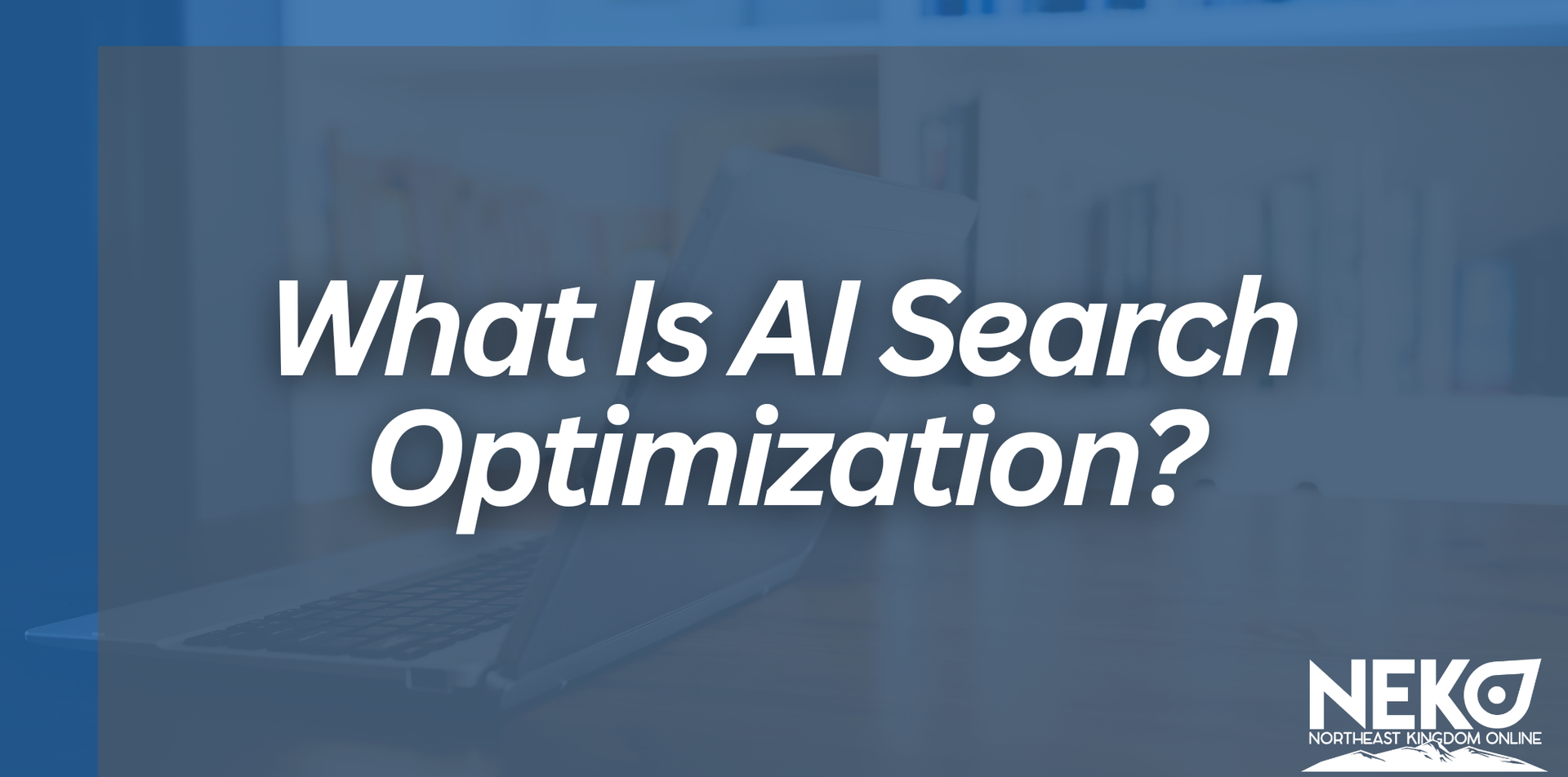
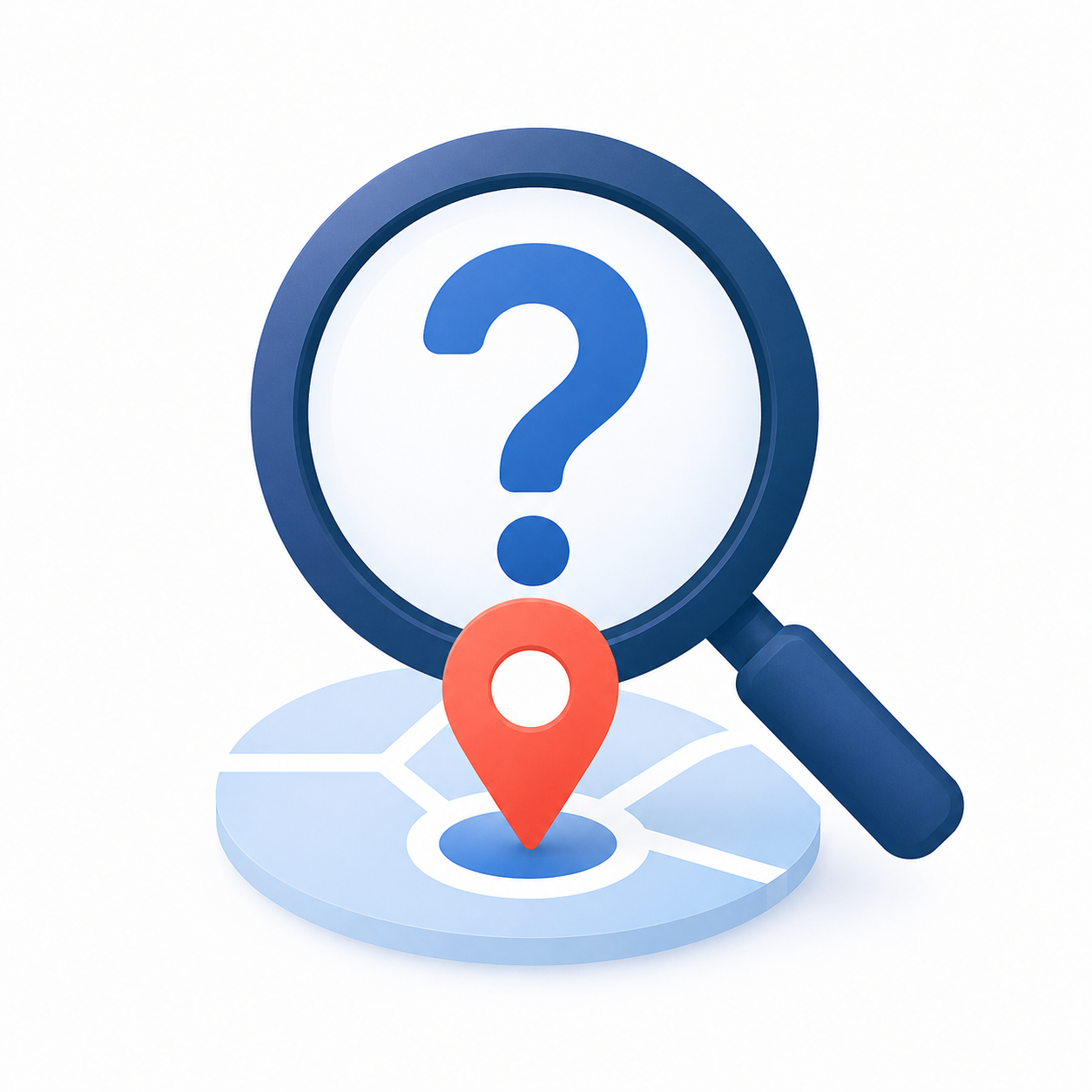
Is your business ready for AI search? Learn how AI Search Optimization can help you get found in ChatGPT and AI-generated results

Learn how NEKO guides businesses from discovery to launch with a process that connects websites, SEO, reviews, listings, and growth.
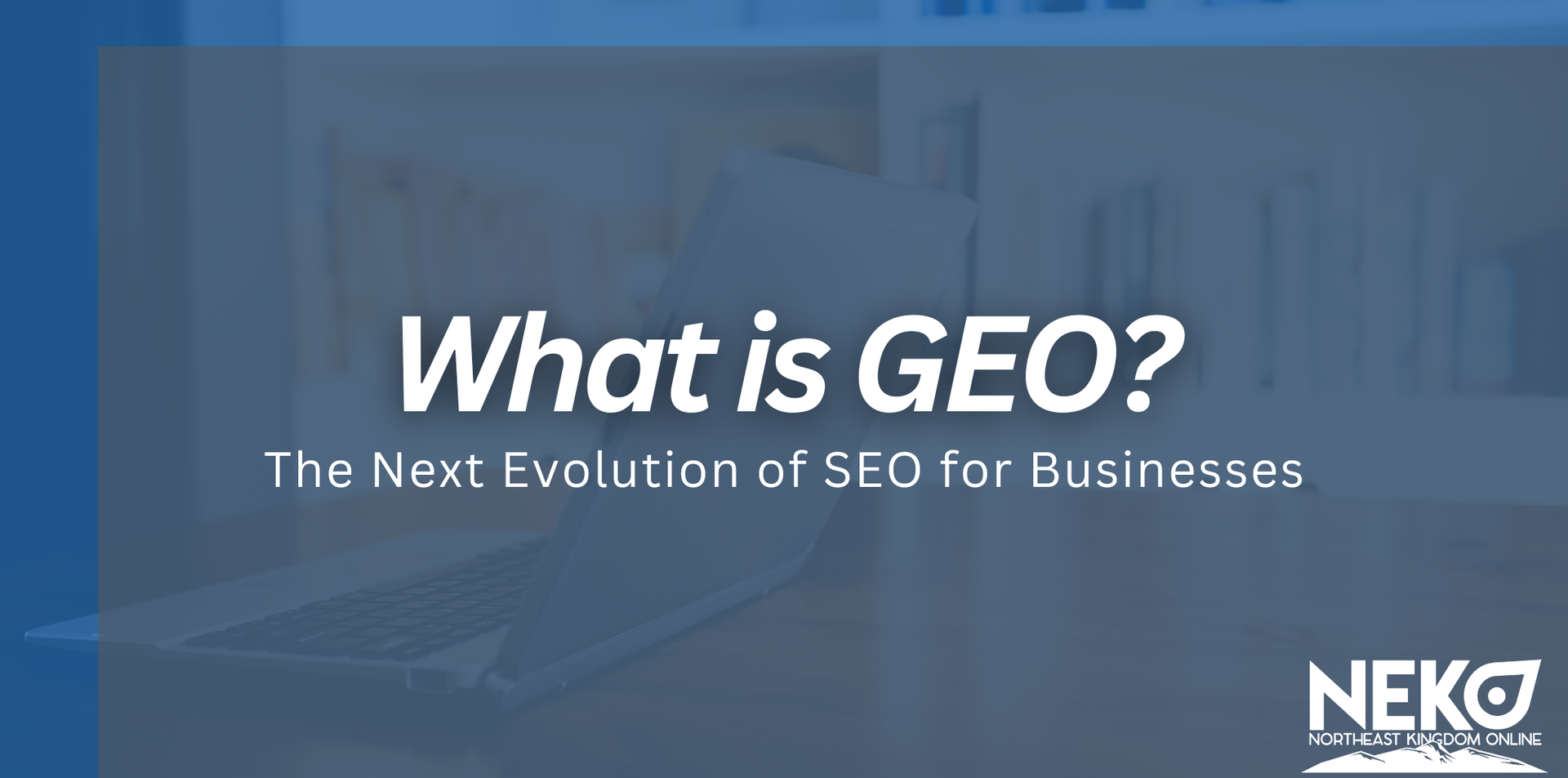
Learn what Generative Engine Optimization (GEO) is and how businesses can improve visibility in AI search and ChatGPT.
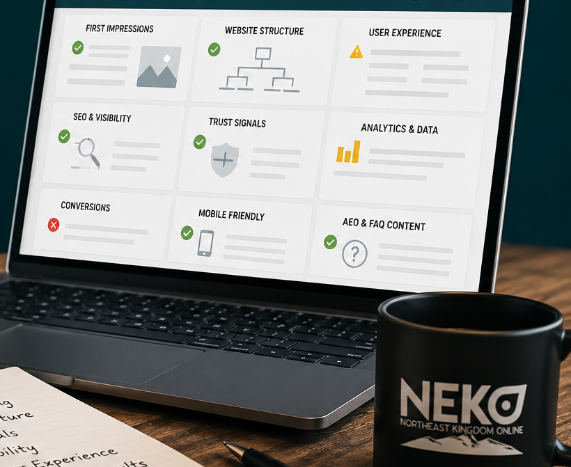
Discover what we evaluate in the first 10 minutes of a website review at NEKO, from SEO and structure to messaging, analytics, and user experience.

Quality over quantity matters in digital marketing. Learn how better targeting, strong analytics, and clear messaging create traffic that converts into real business growth.