
Tips About Using Fonts Wisely
Fonts are a wonderful tool for supporting a website's distinct tone and style, and they need to be used wisely. Here are some tips for choosing your site fonts.
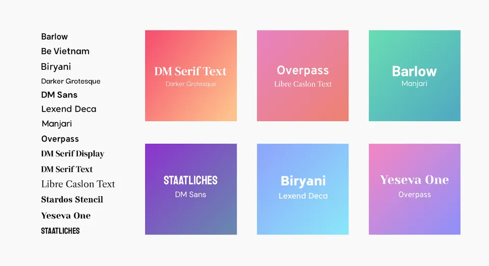
Use two to three fonts on a single website.
Too many fonts can be distracting and unattractive. Use a single font for paragraphs and general texts; use no more than two fonts for titles.
Choose san serif fonts for a more relaxed look.
Sans serif fonts don’t have the little feet on the ends of the letters. They tend to look more modern and are easier to read on titles, buttons, and short texts.
Choose serif fonts for a more serious look.
Serif fonts have little feet attached to the ends of the letters. They tend to look more traditional and formal.
Use bold, fun fonts for titles and short texts.
This is the place for using eccentric fonts as they draw attention to the text.
Make sure fonts are easy to read.
For paragraphs, a good font size is 15 to 18px. For titles, go for something bigger (40 to 100px).

Discover the ins and outs of content marketing and how it can grow your business. We’ll explore the core elements of content marketing, the various formats it takes, and how to implement it effectively.

Learn how to grow your email list naturally by offering value, setting clear expectations, and avoiding common pitfalls that can annoy your customers.

Discover the place of a website for your business in today’s digital world. Do you still need one and how does it affect your business? We answer these questions and break down the value websites have over other alternatives

Learn what to avoid to keep your website a valuable tool for your business. We break down the top 5 web design mistakes that can harm your business.

Improve Your Online Presence Long Term! Learn about the best organic strategies to improve your online visibility through SEO, content, and social media.

Boost your small business's online presence in 2025 with a smart social media strategy—learn how to set goals, choose the right platforms, and create engaging content without burnout.

Learn how to promote local events on social media effectively without overwhelming your audience. Discover engagement strategies, content ideas, and best practices for reaching the right people!

Discover what makes a website accessible and how that affects user reach and SEO. Learn how to optimize your website for maximum inclusion and accessibility.

Learn about the importance of website security and the key security concerns facing your website. We explore specific security risks and how you can secure your website against them.

Redesign your website for success to attract more customers, increase page retention, and see more conversions.
